7 Ways to Use the Right Font in Design
When it comes to a good design, there are many details from color to layout, images to font. The critical role typography plays in the success of a new design is sometimes underestimated.
When it comes to a good design, there are many details from color to layout, images to font. The critical role typography plays in the success of a new design is sometimes overlooked. Choosing the right font among the many options is sometimes a challenge for designers. Some information you will have about font selection in design can make your job easier during the design phase.
1. Pay attention to the placement and alignment of your font.
When placing text in your designs, make sure all text is aligned in the same direction. Usually one of the right, left, and center alignments will be visually good.
Below you can see the two options Lululemon Athletica has used on the Facebook page. The visual design in the first example is a cover prepared for the blog article and is left-aligned. In the second example, the box is used in the middle. As in the example, the text has been placed in the background. Image gaps are among the important factors to consider when deciding on the placement of the text.
2. Your brand's character and its color font style must match.
You should choose the appropriate color and font for your design or brand, carefully and with good thought. Note that the font should reflect the character and spirit of your brand, as you can see in the examples below.
How Do You Choose the Suitable Color for Your Brand?
Each color has different psychological ties and different effects on people. The colors you will strategically use in your brand's color palette will have a significant impact on your brand's potential audience.
You can examine the table below, which includes the psychological effect of which color has on people, the areas of use, the sectors where colors are used frequently and some examples of known brands. You can choose the most suitable color for your brand by using the emotions and values you have determined in your previous branding works and want to highlight.
![]()
How Do You Choose the Most Suitable Font for Your Brand?
Choosing the right font for the brand adds more meaning, purpose and value to your brand identity. It helps the readers to perceive the information correctly and to attract the attention of the target audience. So how to choose the right and suitable font?
If you don't have graphic design skills to create a font from scratch, it's a good idea to go through the available options and try to find the best one. First, there should be a primary font that will be used in the logo and headings, reflecting the work and character. (If a very flashy font is used in the logo, a more modest and legible additional font may be preferred for headings.) Then it should be balanced with a relatively legible, simple and compatible secondary font to be used in text blocks and subheadings.
Quotes (Serif) Font
Font with shapes that look like quotes (or little feet) at the tip of each letter. This old style font will make your brand look classic, reliable and traditional.
Nailless (Sans Serif) Font
Quotes hanging from the ends of the letters in the quoted font are not available in this font and appear more minimalist and simpler than the quoted font. If you want to create a more modern and stylish perception of your brand, you should choose this font.
Handwriting (Script / Handwritten) Font
Handwritten fonts are curved and fancy fonts that feel more handwritten. Used for stylish, feminine and rich looks, while more casually written types can create a sense of informal, childish, or naturalness.
Flashy (Display) Font
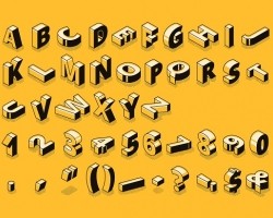
Flashy fonts come in a wide variety, and letters can look very unusual. Because they are completely unique, they are usually registered to the brand. If used with a symbol next to it, it can be too flashy, so they are usually used alone. You can opt for this font to make a bold statement.
3. Make sure the text is legible.
Choosing a legible font is very important, especially if you are using long articles. Long articles in presentations, blog posts should be read easily and quickly. Avoid complex fonts or too long text in capital letters, as these will tire the reader's eyes. The examples given below explain the successful and unsuccessful font selection in terms of readability very clearly.
4. Enrich your design by using different font sizes.
You can create a typographic hierarchy by using different sizes of font sizes and highlight the part you want to emphasize. People naturally see large and stereotyped texts first. Use a large font for your main heading, a slightly smaller font for your subheading, and a slightly smaller font for your body.
5. Try to write all the text in capital letters.
The text used normally on the design appears as in plain sentences, with the first letter written in capital and the others in lowercase. However, if your text is not too long, you can reach a strong and contemporary design and create a greater effect by typing in all capital letters.
Nike sets a successful example by using its slogan created using this technique on its Facebook page.
6. Place your text so it's easy to see.
You need to place your text in clean and open areas. Havaiana's eye-catching design explains this well to us.
7. Shorten the text as much as possible.
While planning your design, try to express the message as quickly as possible. There are many ways to shorten a sentence without losing its meaning. Design is not only about image but also about how you communicate. For example, the cage icon we saw in the example below tells us that there is something about freedom.






Comments