
Tips for Making Design Legible and Highlighting
While RGB is all the vibrant colors seen by the human eye, CMYK is the color space that shows the reflection of light with a mixture of 4 colors. When a design made with Photoshop is printed
While RGB is all the vibrant colors seen by the human eye, CMYK is the color space that shows the reflection of light with a mixture of 4 colors. When a design made with Photoshop is printed, colors do not appear as seen on a computer. For this reason, arranging the design with CMYK color codes makes the colors that will come out after printing more realistic. You should also pay attention to the total ink coverage of your color values.
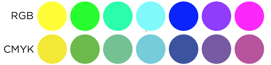
It can only absorb a certain amount of ink due to the saturation of the paper; If the color values are too high, it causes the paper to thin out, the color to bleed or turn black. For this reason, it is necessary to keep the CMYK color values of the works below 270% of the total. Using the output preview setting in Adobe PDF, you can control the colors in the design by moving your mouse.
Be careful with the colors you use
Incorrect selection of your text and background colors can make your design unreadable. Incorrectly matched colors are disturbing, even if they are readable. This discomfort can be effective in the person's decision to read and prevent the writing from meeting with the person. This is an extremely easy problem to fix. You can see examples of common mistakes and eye-pleasing, easy-to-read headlines in the examples below.
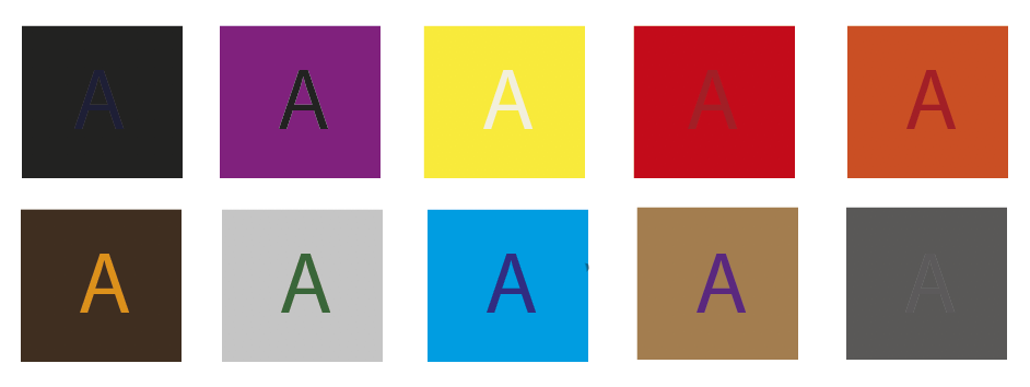
Avoid using light colored text on light backgrounds.

Also avoid using dark text on dark backgrounds.

Do not forget that the text, pattern and image on the background of your design may result in loss of text, pattern and visuals after printing due to low opacity levels or close color values with the ground colors.
Do not forget that a hard-to-see text, pattern and image on the screen can be seen even more difficult after printing and even carries the risk of not being seen.
Make sure your background and texts are in contrasting colors
Your writing on your floor is a contrasting color - combining complementary colors such as orange, yellow and purple, for example. Feel free to use these colors for an exciting and vibrant design. However, you should use these colors in a balanced way, otherwise your design may turn out to be incompatible and eye-straining.
If the ground color and the text / image on it are the same or similar colors, make sure that the tonal difference between them is at least 10%.

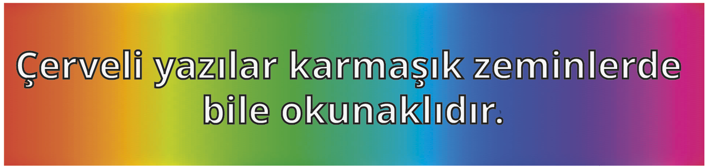
You Can Try On Framed Posts
If you think your texts are not legible and your background color is not solid, you can make the text legible with framed white letters. However, if there is a situation that makes your eyes tired and difficult to read, you can choose a darker color for the frame color. Thus, your articles will be even more legible.
Blog


Comments